
Color is one of the most transformative tools in interior design. It can make a room feel bigger or smaller, energizing or calming, luxurious or minimalist. While furniture, lighting, and décor matter, color is the foundation — the one element that shapes emotional response the moment someone walks into a space.
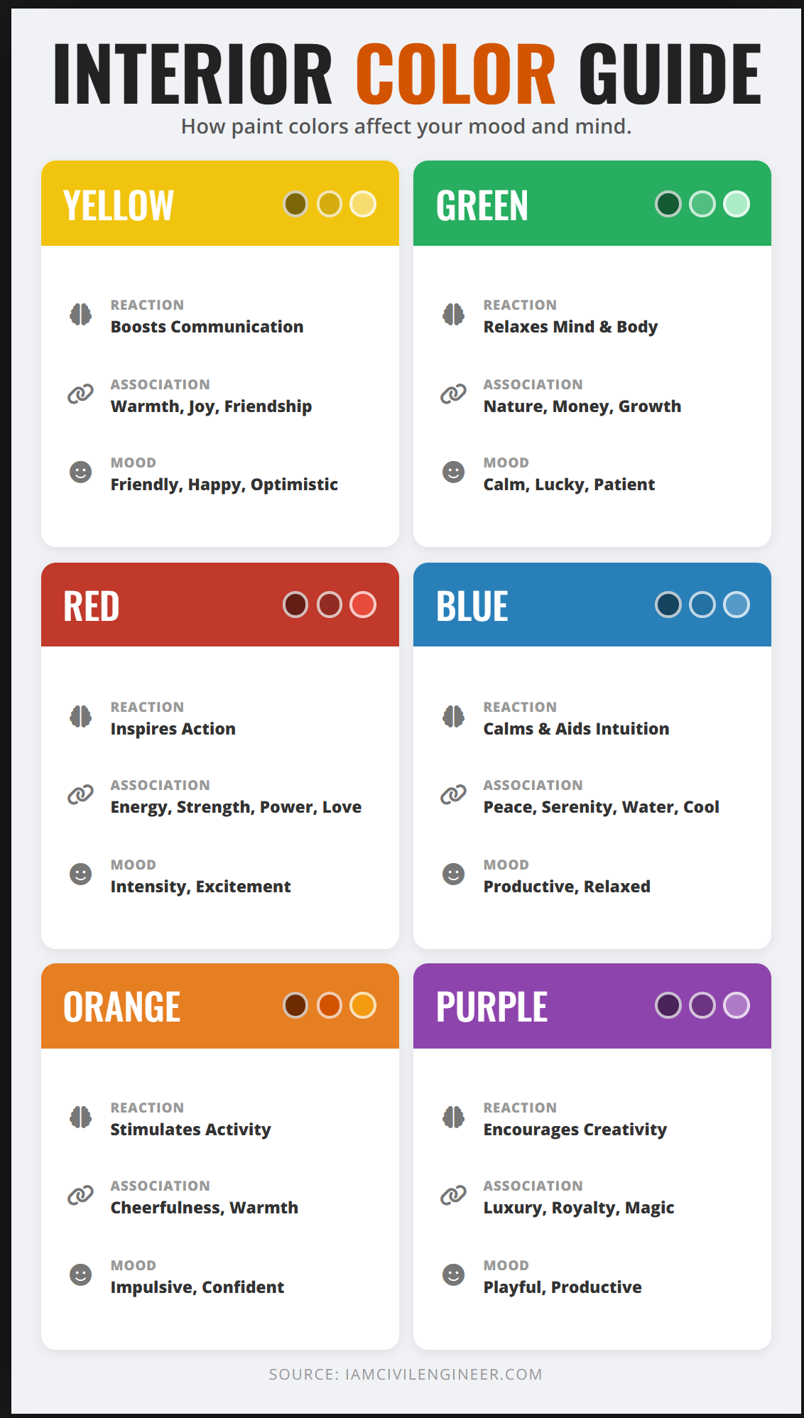
The image you provided beautifully summarizes the psychological associations behind the six key color families — Yellow, Green, Red, Blue, Orange, and Purple. In this three-part in-depth guide, we will expand those concepts into a full, research-backed, designer-approved breakdown that will help homeowners choose the right colors for every room.
Whether you’re a DIY decorator, interior design blogger, or simply choosing your next paint color, understanding color psychology gives you a huge advantage.
What Is Color Psychology in Interior Design?
Color psychology is the study of how different hues affect human emotions, behavior, and overall well-being. In interior design, this becomes a powerful approach that allows you to:
- create the right mood for each room
- support the function of a space
- influence energy levels
- change perception of size and temperature
- elevate the design style
- improve comfort and personal expression
For example:
- Blues make bedrooms feel restful.
- Greens create harmony and balance in living rooms.
- Yellows brighten kitchens.
- Reds energize dining areas.
- Purples encourage creativity.
- Oranges boost activity levels.
These are not random observations; they come from decades of research in psychology, marketing, environmental sciences, and behavioral studies.
The Science Behind Color and Human Emotion
Color affects the brain through the limbic system — the emotional center responsible for mood, memory, and creativity.
Here’s how it works:
- Color enters through the eyes as light wavelengths
Each color has its own unique wavelength that interacts differently with the brain. - The brain interprets the wavelength as an emotional signal
Cool tones tend to calm, while warm tones tend to energize. - A physical and psychological reaction occurs
- Heart rate may change.
- Stress levels may shift.
- Appetite may increase or decrease.
- Cognitive clarity may improve or decline.
- Mood becomes subtly influenced.
This explains why:
- Hospitals use blues and greens (calming).
- Fast-food chains often use red and yellow (stimulating appetite).
- Luxury brands lean toward purple, black, or gold (prestige).
Interior designers use the same psychological principles to shape the experience of a home.
Warm Colors vs. Cool Colors: The Foundation of Color Mood
Before diving into specific colors, it’s important to understand the broader categories:
Warm Colors (Red, Orange, Yellow)
Warm colors tend to evoke:
- energy
- excitement
- movement
- social interaction
- stimulation
They inspire action, conversation, and activity — making them excellent for:
✔ kitchens
✔ dining rooms
✔ playrooms
✔ entertainment spaces
Warm colors visually advance, meaning they feel closer, cozier, and more enveloping.
Cool Colors (Blue, Green, Purple)
Cool colors evoke:
- calmness
- serenity
- focus
- comfort
- introspection
They’re ideal for:
✔ bedrooms
✔ bathrooms
✔ offices
✔ reading corners
✔ meditation spaces
Cool colors visually recede, giving a sense of space, openness, and relaxation.
Color Temperature: Warm, Cool, and Neutral Undertones
One of the biggest mistakes homeowners make is choosing a color without considering undertones.
Undertones determine how a color feels in real life.
For example:
- A gray with blue undertones = cool and modern
- A gray with beige undertones = warm and cozy
- A yellow with green undertones = fresh
- A yellow with orange undertones = golden and traditional
Two colors may look identical on the swatch but radically different on the wall.
Undertones interact with lighting, flooring, and furniture. That’s why a “perfect beige” may look pink or green once painted.
Lighting and Its Role in Color Perception
Light changes everything. The same paint color can look totally different depending on:
1. Natural Light Direction
- North light → cool, bluish
- East light → golden morning, cool afternoon
- South light → warm, bright, best for deep colors
- West light → warm afternoon, reddish
2. Artificial Lighting
- Warm bulbs make colors look softer and more yellow.
- Cool bulbs make colors look crisper and bluer.
- LED vs incandescent dramatically changes how red and purple hues appear.
This is why designers always test paint samples on multiple walls.
Cultural Meaning of Colors (Brief Overview)
Color symbolism varies across cultures. Understanding this adds depth to design choices:
Yellow
- Western: happiness, optimism
- Asian: sacred, imperial, wisdom
Red
- Western: passion, power
- Asian: luck, celebration, joy
Blue
- Western: trust, calm
- Middle Eastern: protection, spirituality
Green
- Western: nature, growth
- Islamic cultures: sacredness
Purple
- Western: royalty
- Eastern: spirituality and mourning (in some regions)
Modern interior design continues to blend global interpretations, creating richer meaning.
The Role of Color in Modern Design Styles (2025 Trends)
Different colors enhance different design aesthetics:
Minimalism
- Whites, beiges, soft grays
- Pale blue or sage as accents
Modern & Contemporary
- Bold contrasts
- Charcoal, navy, hunter green
- Pops of yellow or red
Scandinavian
- Muted colors
- Dusty pastels
- Cool blues + warm wood tones
Bohemian
- Terracotta
- Mustard yellow
- Rich purples
- Earthy greens
Coastal
- Light blue
- Seafoam green
- Sandy neutrals
Traditional
- Warm reds
- Gold
- Deep greens
- Navy
Understanding this helps blend psychology with personal design preferences.
How Color Influences Perception of Space
Color can make a room feel:
✔ larger
✔ smaller
✔ taller
✔ cozier
✔ wider
✔ brighter
✔ cooler
✔ warmer
Here’s how:
- Light colors → expand a room
- Dark colors → add drama and intimacy
- Cool colors → make space feel larger
- Warm colors → bring the walls inward
- Vertical color blocking → makes ceilings seem higher
- Horizontal color blocking → widens the room
These tricks allow you to use color strategically based on room size.
Transition: A Deep Dive Into Each Color Family
Now that we’ve established the foundation — psychology, science, undertones, lighting, cultural significance, and stylistic application — we can explore each color in detail.
Each section will include:
- Mental reaction
- Emotional associations
- Mood
- Best and worst rooms
- 2025 trending shades
- How designers use it
- Mistakes to avoid
- Real-world examples
🌼 1. Yellow — Energy, Happiness & Mental Clarity
Yellow is the color of sunshine, cheerfulness, and creative energy. It’s one of the most psychologically stimulating colors and has a powerful effect on the mind.
🎨 Psychological Meaning
Yellow is often associated with:
- Optimism
- Warmth
- Joy
- Mental stimulation
- Creativity
- Confidence
Studies show that yellow activates the left side of the brain, the area responsible for:
- decision-making
- analytical thinking
- creativity
- logical processing
This is why many creative studios and classrooms include yellow accents.
🧠 Emotional Reaction
Yellow triggers:
- alertness
- enthusiasm
- happiness
- clarity
Because it reflects high amounts of light, yellow also increases the feeling of warmth and luminosity.
🏡 Best Rooms for Yellow
Yellow works beautifully in:
- Kitchens — creates morning-energy vibes
- Dining rooms — encourages conversation
- Entryways — feels welcoming
- Breakfast nooks — bright, uplifting
- Home offices — boosts creativity
🚫 Rooms to Avoid
Yellow is not ideal for:
- Bedrooms (can overstimulate)
- Bathrooms with cool lighting (can turn “neon”)
- Media rooms (creates glare)
🎨 Designers’ Favorite Shades of Yellow (2025)
- Muted Mustard Yellow — grounding warmth
- Soft Buttery Yellow — light, airy, elegant
- Goldenrod — rich and timeless
- Pale Pastel Yellow — great for Scandinavian decor
❌ Common Yellow Mistakes
- Using bright yellow on all walls (too stimulating)
- Pairing high-saturation yellow with red (overpowering)
- Forgetting light-temperature compatibility
🌿 2. Green — Calm, Renewal & Natural Balance
Green is the most restful color for the human eye because it sits at the center of the visible spectrum. It balances warm and cool tones, giving it a uniquely calming effect.
🎨 Psychological Meaning
Green represents:
- harmony
- balance
- growth
- healing
- renewal
- tranquility
- prosperity
Biologically, humans associate green with nature, safety, and abundance.
🧠 Emotional Reaction
Green is known for:
- reducing anxiety
- lowering heart rate
- improving focus
- stabilizing mental energy
- creating feelings of safety
It’s often used in therapy spaces, spas, and hospitals for this reason.
🏡 Best Rooms for Green
Green shines in:
- Living rooms — comfortable, welcoming
- Bedrooms — promotes deep rest
- Bathrooms — spa-like comfort
- Home offices — improves concentration
- Sunrooms — enhances natural feel
🚫 Rooms to Avoid
Green may not work well in:
- Low-light rooms (dark greens can turn muddy)
- Tiny rooms without windows (can feel heavy)
🎨 2025 Trendy Greens
- Sage Green — the #1 trending interior color
- Dusty Olive — grounding, mature
- Pistachio Green — fresh, uplifting
- Deep Forest Green — luxurious and bold
- Mint Green — cool, refreshing
❌ Common Green Mistakes
- Using too much dark green in dim rooms
- Choosing green with hidden yellow undertones (turns “neon”)
- Mixing green incorrectly with beige (undertone clash)
❤️ 3. Red — Passion, Boldness & Appetite Stimulation
One of the strongest colors psychologically, red has the power to stimulate emotions much more intensely than any other hue.
🎨 Psychological Meaning
Red represents:
- passion
- energy
- confidence
- appetite
- intensity
- strength
- excitement
Red is proven to increase:
- metabolic rates
- appetite
- heart rate
- conversation volume
This is why restaurants often use red.
🧠 Emotional Reaction
Red triggers:
- excitement
- intensity
- stimulation
- heightened senses
- sociability
It is powerful, so the key is using it intentionally.
🏡 Best Rooms for Red
Red works best in:
- Dining rooms — elevates appetite & energy
- Entryways — bold and memorable
- Accent walls — striking visual impact
- Game rooms / entertainment rooms — fun & lively
- Kitchens (sparingly) — classic and warm
🚫 Rooms to Avoid
Red should not dominate in:
- Bedrooms (overstimulating)
- Home offices (reduces concentration)
- Bathrooms (may feel aggressive)
🎨 2025 Trendy Reds
- Brick Red — rustic elegance
- Terracotta Red — warm & earthy
- Garnet Red — sophisticated luxury
- Coral Red — cheerful, summery
- Burnt Red — modern and dramatic
❌ Common Red Mistakes
- Painting an entire room bright red
- Pairing red with neon yellow (too intense)
- Using red in tight spaces (feels claustrophobic)
🌊 4. Blue — Peace, Stability & Emotional Calm
Blue is consistently ranked the world’s most popular color. It’s timeless, soothing, and strongly tied to emotional stability.
🎨 Psychological Meaning
Blue symbolizes:
- calm
- clarity
- trust
- peace
- wisdom
- stability
Blue lowers:
- heart rate
- stress levels
- blood pressure
This is why it’s used in bedrooms and bathrooms so often.
🧠 Emotional Reaction
Blue creates:
- relaxation
- tranquility
- emotional release
- improved sleep
- mental clarity
It’s especially effective for stress relief.
🏡 Best Rooms for Blue
- Bedrooms — promotes restful sleep
- Bathrooms — spa-like calm
- Living rooms — cool, composed ambiance
- Home offices — supports mental focus
- Coastal-inspired spaces
🚫 Rooms to Avoid
Blue may not work well in:
- North-facing rooms with cool light (may turn icy)
- Kitchens (unless warmed with wood tones)
- Dining rooms (suppresses appetite)
🎨 2025 Trending Blues
- Navy Blue — timeless and sophisticated
- Dusty Powder Blue — soft & dreamy
- Slate Blue — modern and balanced
- Teal Blue — rich & bold
- Pale Sky Blue — light & airy
❌ Common Blue Mistakes
- Using blue without warm accents (feels cold)
- Choosing too much gray-blue (can feel dull)
- Painting small bathrooms navy without proper lighting
🍊 5. Orange — Excitement, Enthusiasm & High Energy
Orange is a dynamic, uplifting, and socially stimulating color. It blends the energy of red with the happiness of yellow.
🎨 Psychological Meaning
Orange symbolizes:
- creativity
- enthusiasm
- success
- adventure
- motivation
- sociability
Orange increases oxygen supply to the brain, boosting energy levels.
🧠 Emotional Reaction
Orange triggers:
- motivation
- fun
- excitement
- warmth
- social interaction
It’s great for rooms meant for activity and creativity.
🏡 Best Rooms for Orange
- Kitchens — invigorating and cheerful
- Home gyms — energizing
- Kids’ playrooms — fun and stimulating
- Entryways — warm and inviting
- Craft rooms — boosts creativity
🚫 Rooms to Avoid
Avoid heavy orange in:
- Bedrooms (too stimulating)
- Offices (reduces deep concentration)
- Formal dining rooms
🎨 2025 Trendy Oranges
- Terracotta — warm and earthy
- Peach — soft and modern
- Apricot Orange — refreshing and pretty
- Clay Orange — organic and deep
- Burnt Orange — bold and elegant
❌ Common Orange Mistakes
- Using TOO bright orange (can look childish)
- Not pairing it with neutrals
- Overusing orange in small spaces
💜 6. Purple — Creativity, Luxury & Emotional Depth
Purple has a long history of symbolism, often connected with royalty, mystery, and imagination.
🎨 Psychological Meaning
Purple represents:
- luxury
- creativity
- spirituality
- imagination
- wisdom
- calm energy
Lavender is calming, while deeper purples are dramatic and luxurious.
🧠 Emotional Reaction
Purple triggers:
- introspection
- creativity
- emotional connection
- elegance
It’s one of the most versatile colors depending on shade.
🏡 Best Rooms for Purple
- Bedrooms — calming lavender tones
- Living rooms — soft plum adds elegance
- Meditation rooms — spiritual
- Art studios — sparks creativity
- Powder rooms — bold and stylish
🚫 Rooms to Avoid
Avoid heavy purple in:
- Kitchens (feels unnatural)
- Large living rooms with poor lighting (can feel heavy)
🎨 2025 Trendy Purples
- Dusty Lavender — soft and romantic
- Muted Lilac — contemporary pastel
- Plum Purple — luxurious and moody
- Aubergine — rich and dramatic
- Violet Gray — modern, balanced
❌ Common Purple Mistakes
- Using bright purple in adult rooms (feels childish)
- Pairing purple with saturated pinks
- Choosing purple with blue undertones in cold-light rooms